
Brand Identity
Hospitality
When Café Mado approached us to develop their brand identity, they had a clear vision—one that was rooted in the elegance and legacy of Madame Pointe, a culinary icon known for her exceptional standards. With this inspiration, Café Mado set out to become more than just a café; it aimed to reflect sophistication, heritage, and artistry, seamlessly blending these elements into the Brooklyn coffee scene.
Our goal was to capture the essence of Madame Pointe in every facet of the brand identity, from the visual elements to the ambiance. Café Mado demanded a narrative that would honor tradition while embracing modern charm. This balance guided our decisions across multiple aspects of the brand.

We meticulously studied Madame Pointe’s handwriting, drawing inspiration from its natural flow and personal charm. The result is a hand-scripted wordmark that evokes both elegance and authenticity, mirroring the warmth of handwritten recipes and honoring her culinary legacy.


To highlight its deep connection to its surroundings, we created hand-drawn illustrations inspired by the local environment. These include detailed sketches of the café’s building, the Brooklyn Museum, and nearby trees, capturing the essence of the neighborhood. The illustrations emphasize that Café Mado is a reflection of its environment, rooted in the community and culture of Brooklyn.
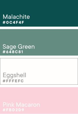
We anchored the brand with a deep emerald green, embodying both refinement and calm, inspired by nature and the elegance of the café’s environment. To complement the richness of the emerald, we introduced a soft pink, adding a delicate contrast that balances the palette. Together, these colors create a harmonious blend of vibrancy and subtlety, making the brand feel both sophisticated and approachable.


See why business owners believe Konsist is the team they were missing!


